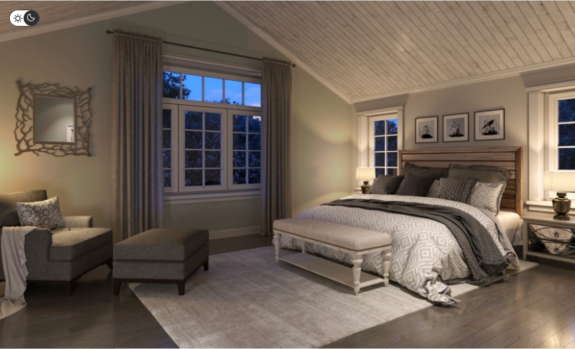
Your bedroom is the one place designed for rest — yet the wrong paint color can quietly work against it.
Color psychology shows that hues affect our mood, energy, and even how well we sleep.
To create a restful, restorative space, choose colors that calm the mind, lower stress hormones, and complement your lighting and décor.
Below, we’ll explore how color psychology works, which paint colors are scientifically linked to relaxation, and how Cleveland homeowners can use light, temperature, and local style to set the perfect tone.
🎨 The Science Behind Color Psychology
Colors trigger both emotional and physical responses. Studies from the National Sleep Foundation and the University of Sussex show that cool, muted hues (like soft blues and greens) can slow heart rate and lower blood pressure, while bright reds and oranges can raise alertness and even body temperature.
Here’s how it works:
-
Cool tones (blue, green, gray) = calm, stability, focus.
-
Warm tones (beige, blush, soft peach) = comfort, warmth, emotional security.
-
Bold tones (red, orange, yellow) = energy and creativity — great for living rooms, not bedrooms.
Your paint color sets the emotional baseline for your nightly routine.
In wintery climates like Cleveland’s, that means striking a balance: cozy enough to counter long, gray days, yet cool enough to feel serene at night.
🌙 Best Paint Colors for a Relaxing Bedroom
1. Soft Blues
Psychology: Blue is consistently rated as the most calming color worldwide. It’s associated with trust, sky, and water — elements our brains read as safe and infinite.
Effect: Lowers blood pressure and promotes deeper sleep.
Sherwin-Williams Picks:
-
Misty (SW 6232): Gentle gray-blue that adapts beautifully to low natural light.
-
Sea Salt (SW 6204): A pale, green-gray-blue that shifts with the light — ideal for moody Cleveland days.
-
Sleepy Blue (SW 6225): Slightly more pigment for cozy winter evenings.
Design Tip: Pair blue walls with crisp white trim and natural textures like oak or linen to keep the space grounded.
2. Muted Greens
Psychology: Green symbolizes balance, growth, and tranquility. It’s the most restful color for the eyes.
Effect: Calms nervous energy, reduces eye strain, and blends easily with wood furniture or plants.
Sherwin-Williams Picks:
-
Clary Sage (SW 6178): A timeless sage that feels earthy but not heavy.
-
Rainwashed (SW 6211): Light and airy with just a hint of blue undertone.
-
Evergreen Fog (SW 9130): 2022 Color of the Year — a serene green-gray perfect for modern bedrooms.
Design Tip: Works beautifully with matte black fixtures or brass lighting to add warmth without losing serenity.
3. Warm Neutrals
Psychology: Beige, taupe, and greige tones create comfort and stability. They mimic natural light and feel timeless.
Effect: Ideal for shared bedrooms or if you change décor often — they adapt to every style.
Sherwin-Williams Picks:
-
Accessible Beige (SW 7036): A balanced greige with just enough warmth to offset Cleveland’s gray winters.
-
Canvas Tan (SW 7531): Soft and cozy — makes small rooms feel bigger.
-
Drift of Mist (SW 9166): A subtle off-white that pairs with everything.
Design Tip: Layer with texture — chunky throws, rattan accents, or soft curtains — to keep the palette from feeling flat.
4. Lavender and Soft Mauve
Psychology: Purple blends the calm of blue with the comfort of red. In its lighter forms, it soothes anxiety and supports creativity.
Effect: Encourages relaxation without feeling cold.
Sherwin-Williams Picks:
-
Veiled Violet (SW 6268): Light and airy — perfect for a romantic, dreamy space.
-
Lite Lavender (SW 6554): Pairs well with whites or warm grays.
Design Tip: Use as an accent wall or pair with white trim and silver décor for a sophisticated feel.
5. Gentle Warm Whites
Psychology: White symbolizes clarity and calm, but pure bright whites can feel sterile. Warm or creamy whites create a spa-like serenity.
Effect: Makes smaller Cleveland bedrooms feel open, clean, and sun-filled, even in winter.
Sherwin-Williams Picks:
-
Alabaster (SW 7008): Balanced warmth — brightens dark rooms without glare.
-
Greek Villa (SW 7551): Subtle beige undertones soften northern light.
-
Snowbound (SW 7004): A designer favorite for modern, airy bedrooms.
Design Tip: Combine with warm wood flooring or soft metallics to keep the room inviting.
🕯️ Colors to Avoid in Bedrooms
Even beautiful hues can backfire if they stimulate rather than relax. Avoid:
-
Bright reds or oranges: Energizing tones that raise heart rate.
-
Dark grays or charcoals: Can feel heavy or confining in Cleveland’s long winter months.
-
Neon yellows or greens: Distracting to the eye; better for offices or creative spaces.
If you love bold colors, save them for accents or art, not entire walls.
🪞 How Lighting and Sheen Change Color Perception
Light plays a huge role in how paint looks — especially in Cleveland homes where sunlight shifts dramatically by season.
Natural Light
-
North-facing rooms: Cool, blue light. Use warmer paint tones to balance it.
-
South-facing rooms: Strong light — can handle cooler tones.
-
East/West-facing rooms: Changeable light; test swatches morning and evening.
Artificial Light
-
Warm white bulbs (2700–3000K): Complement neutrals and warm whites.
-
Daylight bulbs (5000K): Emphasize blues and greens, great for crisp modern looks.
Sheen Selection
-
Flat/Matte: Best for walls — hides imperfections, feels soft and cozy.
-
Satin/Eggshell: Adds a touch of reflection; ideal for durable but relaxed surfaces.
-
Gloss: Avoid for bedrooms — too reflective and stimulating.
🪴 Cleveland-Specific Considerations
1. Long Winters, Short Days
Choose warmer neutrals or green-grays to balance gray skies. Alabaster, Accessible Beige, and Sea Salt perform beautifully under overcast light.
2. Dry Air and Static
Rich tones can appear dusty or dull in winter’s low humidity. Keep color saturation moderate and maintain even lighting.
3. Older Home Challenges
Cleveland’s classic homes often have small or low-ceiling bedrooms. Light, reflective colors like Alabaster or Misty visually expand the space.
4. Summer Humidity
Cool tones like Rainwashed or Clary Sage help rooms feel fresh when humidity rises.
🧘 Using Color Psychology Beyond Walls
Paint sets the tone, but your surroundings complete the calm.
-
Textiles: Stick to soft, muted hues and natural fibers.
-
Accents: Add greens (plants), blues (linens), or warm wood (nightstands).
-
Lighting: Install dimmable lamps or warm LED strips to reduce glare before bedtime.
The goal: a sensory balance where color, light, and texture all signal “rest.”
❓ FAQ: Choosing Relaxing Bedroom Paint Colors
Q: What color helps you sleep best?
Blue and soft green shades promote calm and reduce anxiety, leading to better sleep quality.
Q: How do I test paint colors before committing?
Paint 2×2 ft swatches on multiple walls and observe them through morning, afternoon, and evening light.
Q: Are darker colors always bad for bedrooms?
Not always. Deep navy or charcoal can feel cocoon-like if balanced with warm lighting and light bedding.
Q: What’s the most versatile neutral for bedrooms?
“Accessible Beige” or “Drift of Mist” from Sherwin-Williams — both adapt to any lighting.
Q: Should ceiling color match walls?
In low ceilings, keep ceilings white to open the space. For high ceilings, a 25% lighter mix of your wall color keeps things cohesive.
🏡 Conclusion
Color psychology isn’t design fluff — it’s a practical way to improve your sleep, mood, and comfort.
In Cleveland’s fluctuating seasons, paint can act as light therapy: bright in the gray months, cool in the humid ones, and calm year-round.
Stick with soft blues, muted greens, warm neutrals, or creamy whites, and your bedroom will become more than just a place to crash — it’ll become a sanctuary built for rest, recovery, and peace.

Scan to join our Loyalty Program, get a free coupon for your next service, and stay up to date on our services and articles.
Affiliate Note
Some of the links in this article may be affiliate links. That simply means if you choose to buy through them, I may earn a small commission at no extra cost to you. I only recommend products I trust and would feel comfortable installing in my own home or a client’s home.
If you try something I recommended and it turns out to be anything less than a five-star experience, please let me know. I always want these recommendations to be genuinely helpful.